Animate data for storytelling
Turn CSV and spreadsheet metrics into animated charts that read in video. Renimate’s chart animation workflow is built for data visualization animation in marketing and product storytelling—not static exports from a BI tool.

The Challenge: Static Metrics Don't Sell
Attach structured files and describe the insight viewers should leave with. Renimate emphasizes legibility—axes, labels, and motion that reinforce the takeaway. This prevents your audience's eyes from glazing over a spreadsheet snapshot.
- Supports tabular inputs for chart animation workflows
- Motion aligned to professional reporting aesthetics
- Pairs with UI shots when metrics live inside the product
The Solution: Animated Charts from CSV
Upload your file, name the key columns and the comparison you want to show, and iterate in chat when the story changes. Re-export rapidly when numbers update close to your launch date.
Key Capabilities for SaaS and B2B
Use animated data in investor updates, category education, and product tours. Keep one consistent narrative thread from metric proof all the way to product UI.
How It Works: Animate Your Spreadsheets
Upload your CSV or JSON data and select the chart type. Renimate automatically interpolates the data points, creating smooth, professional animations that build up your charts over time. Adjust colors and labels to match your brand guidelines.
Who Should Use This
Consultants, researchers, and marketing teams who want to present industry reports, survey results, or growth metrics in an engaging, digestible video format.
Questions
What file types work for chart animation?
Use CSV, spreadsheets, or JSON-style structured inputs per the workflow limits in the composer. Describe fields and the insight so motion matches the data story.
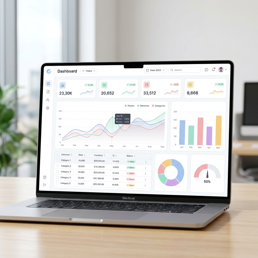
Can I combine charts with dashboard screenshots?
Yes—many teams pair chart animation with dashboard UI sections so viewers see both the metric and the surface where it lives.
Is this a full BI replacement?
No—Renimate produces motion for video. Explore and validate data in your analytics tools first, then animate the winning views here.
Ready to try it yourself?
Start building your next marketing video in minutes. Describe your goal, attach your assets, and let AI handle the motion.
Generate your videoRelated blog posts
How to animate a dashboard screenshot for marketing
A practical workflow: from static analytics UI to short motion for landing pages and social—without rebuilding your product in After Effects.
Read articleThe hidden costs of hiring a motion design agency
A breakdown of what you actually pay for when outsourcing your SaaS product videos, and how to bring motion design in-house.
Read articleHow to make a product demo video that actually converts
Step-by-step guide to writing, animating, and distributing product demos that drive signups instead of bounces.
Read article